
1. Project Overview
Background:
Greener is a plant supplies store looking to create a free-all in one houseplant diagnostics app that helps plant parents keep their plants alive by accurately diagnosing ailments and providing easy to understand treatment plans.
Problem:
According to 2024 data from SWNS Research, 7 in 10 millennials identify themselves as a "Plant Parent." Despite this, the average millennial has killed 7 of their houseplants, with half of all American plant owners questioning their ability to care for their plants enough to keep them alive. With 66% of all American households owning at least one houseplant, demand has surged year over year. Around 60 percent of millennials have anxieties relating to plant care, the most commonplace being ensuring plants get enough sunlight & water, as well as general worries about keeping the plant alive.
Goal:
The end goal for Greener is to provide an easy to understand interface for so-called Plant Parents to not only allow their plants to survive, but to have them thrive by easily identifying ailments. In addition, to offer treatment plans after the symptoms are accurately identified.
Project Scope:
Mobile Houseplant Management App
Services Rendered:
User Experience (UX) Designer | UX Researcher (UXR) | Interaction (IxD) Designer | User Interface (UI) Designer | Visual Designer
Duration
December 2023 - February 2024
Approximately 100 hours
Approximately 100 hours
2. Research
Pain Points:
Worries About Watering: The average houseplant owner's biggest struggle revolves around over-watering or under-watering their plants, though these are not easily distinguishable without prior knowledge.
Disease & Pests: Many plant parents do not know how to tell the difference between various diseases & pests. This is made more difficult by the fact that there are many different ailments with similar symptoms.
Frustrations with lack of Reliable Information: Despite the sheer amount of plant owners, information about how to accurately take care of said issues can be hard to find, with myths often repeated through word of mouth, leading to frustration for plant owners.
Initial User Research:
Due to the sheer amount of different types of people who own and take care of houseplants, a variety of research methods were of use for this project. For step one, I looked into the data of the type of people who own houseplants.
The gender gap of houseplant purchasers is perhaps surprisingly smaller than one would think- I found that 60% of plant purchasers of the last year (2023) skewed female, compared to 39.5% male. Another 2021 study cited a much closer gap, skewing only 52% female.
Additionally of note, there is a generational gap. According to a survey conducted in the United States and released in 2021, houseplants were most popular with baby boomer and millennial respondents. While millennials made up 34 percent of houseplant purchasers, baby boomers represented the largest share, at 45 percent, as cited by Statista. This presented challenges for accessibility, as while the elder generation will generally have the most experience caring for houseplants, they also may have concerns with eyesight. Also of note was reasoning for owning a plant, with a rise in Gen-Z plant owners citing their desire to care for something alive.
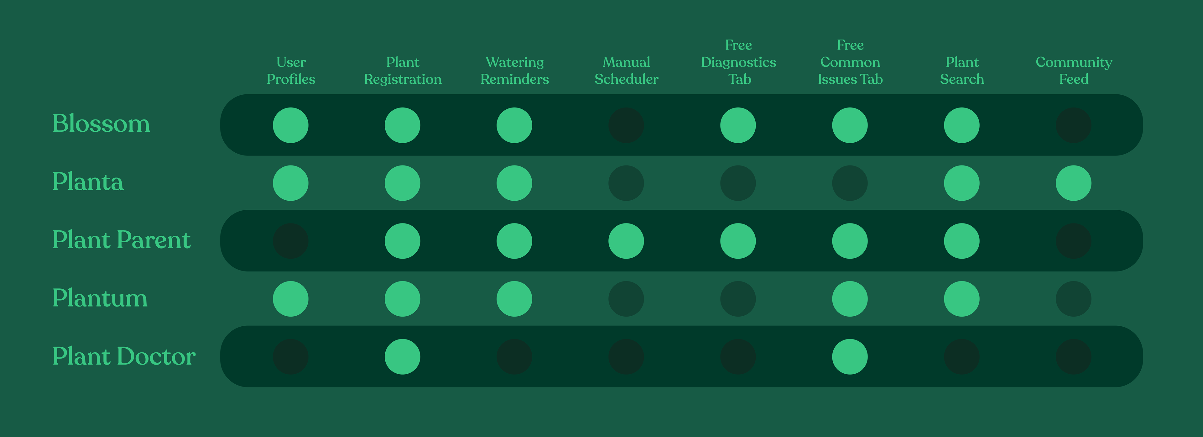
Competitive Audit:
Beyond the initial user research, a competitive analysis was in order, to identify the main competitors in the plant maintenance app market & understand their target audience.
5 direct competitors in the space were of note, (Blossom, Planta, Plant Parent, Plantum, Plant Doctor / Novado Plant), as well as in-person indirect competitors, providing me valuable information on gaps & opportunities in the market that Greener could offer to its users:
Many of the aforementioned apps locked their diagnostics tab behind paywalls, and those that didn't were either lacking in information or extremely hard to navigate successfully. This is a pain point for many users who cannot justify monthly payments to take care of plants.
The competition that did not lock their diagnostics behind a paywall required a plant to be registered on the app before searching for issues, a time-consuming task where many will delete the app and immediately do a Google Search instead.
3. Empathize & Define
Problem Statements:
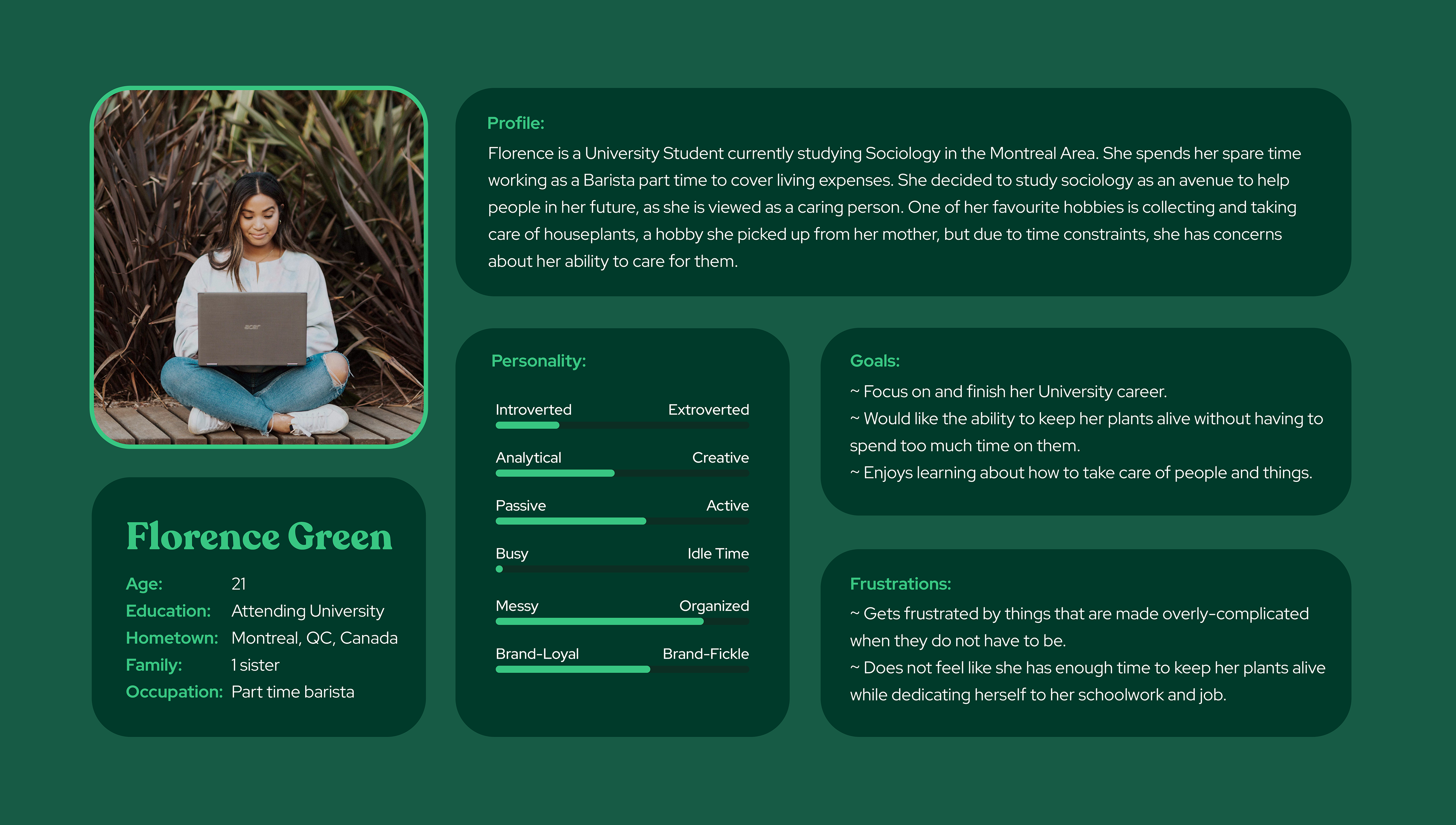
Florence Green is a full-time student & part-time barista who needs a way to quickly get reliable information on how to take care of her houseplants.
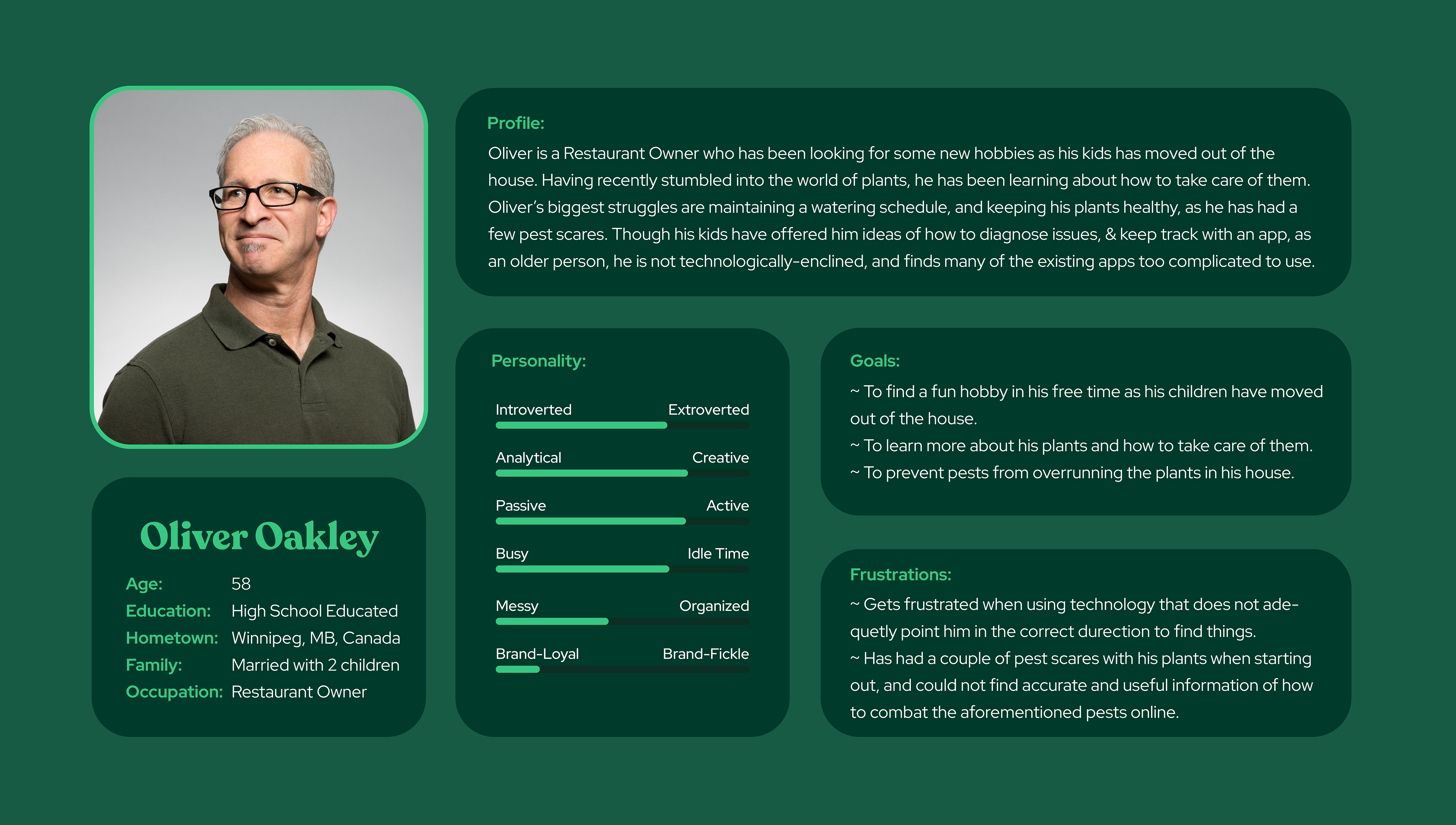
Oliver Oakley is a semi-retired business owner who needs the ability to understand his houseplant's ailments and how to start treatment, despite not being tech-savvy.
Persona Development:
From my research, I identified 2 key groups of users who would benefit from the app. Those being people who know more about plants, and those who know less about plants.
Florence Green represents a group of users who are knowledgeable about plants, busy, looking for a quick and reliable way to get information on their houseplants, as well as maintain a schedule. The following user story was developed for Florence: "As a full-time student and plant-parent, with a part time job and not a lot of extra time, I want to have an app that helps me keep track of my plants easily from my phone."
Oliver Oakley represents an older demographic that may be less technologically inclined than younger users. The following user story was developed for Oliver: "As a semi-retired restaurant owner who is getting into houseplants as a hobby, I want to be able to treat my pest problem quickly while knowing very little about houseplants."
Oliver Oakley represents an older demographic that may be less technologically inclined than younger users. The following user story was developed for Oliver: "As a semi-retired restaurant owner who is getting into houseplants as a hobby, I want to be able to treat my pest problem quickly while knowing very little about houseplants."
4. Ideate
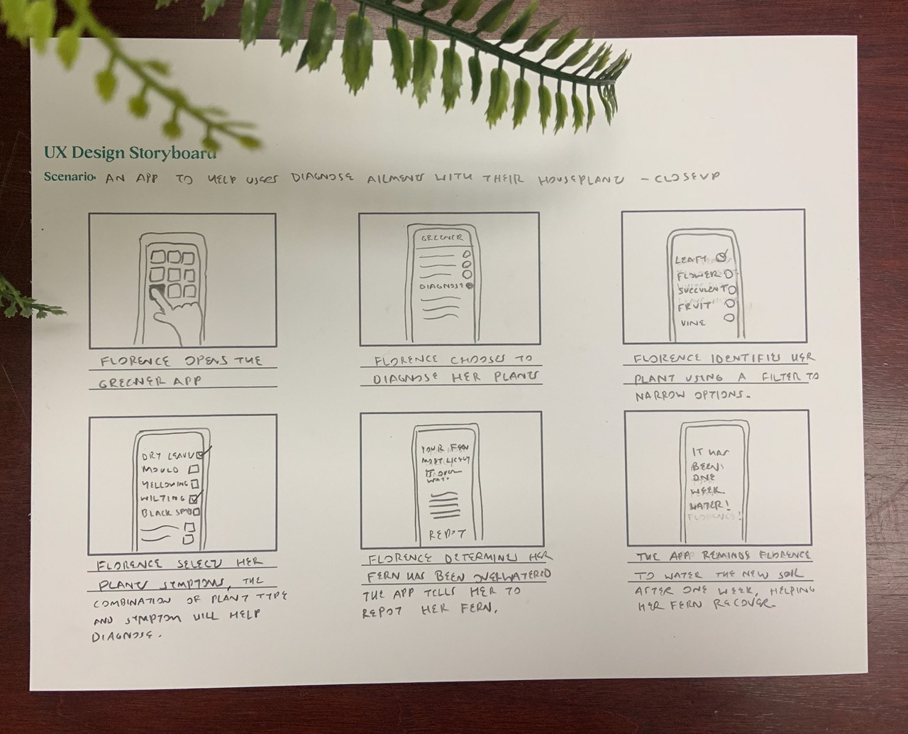
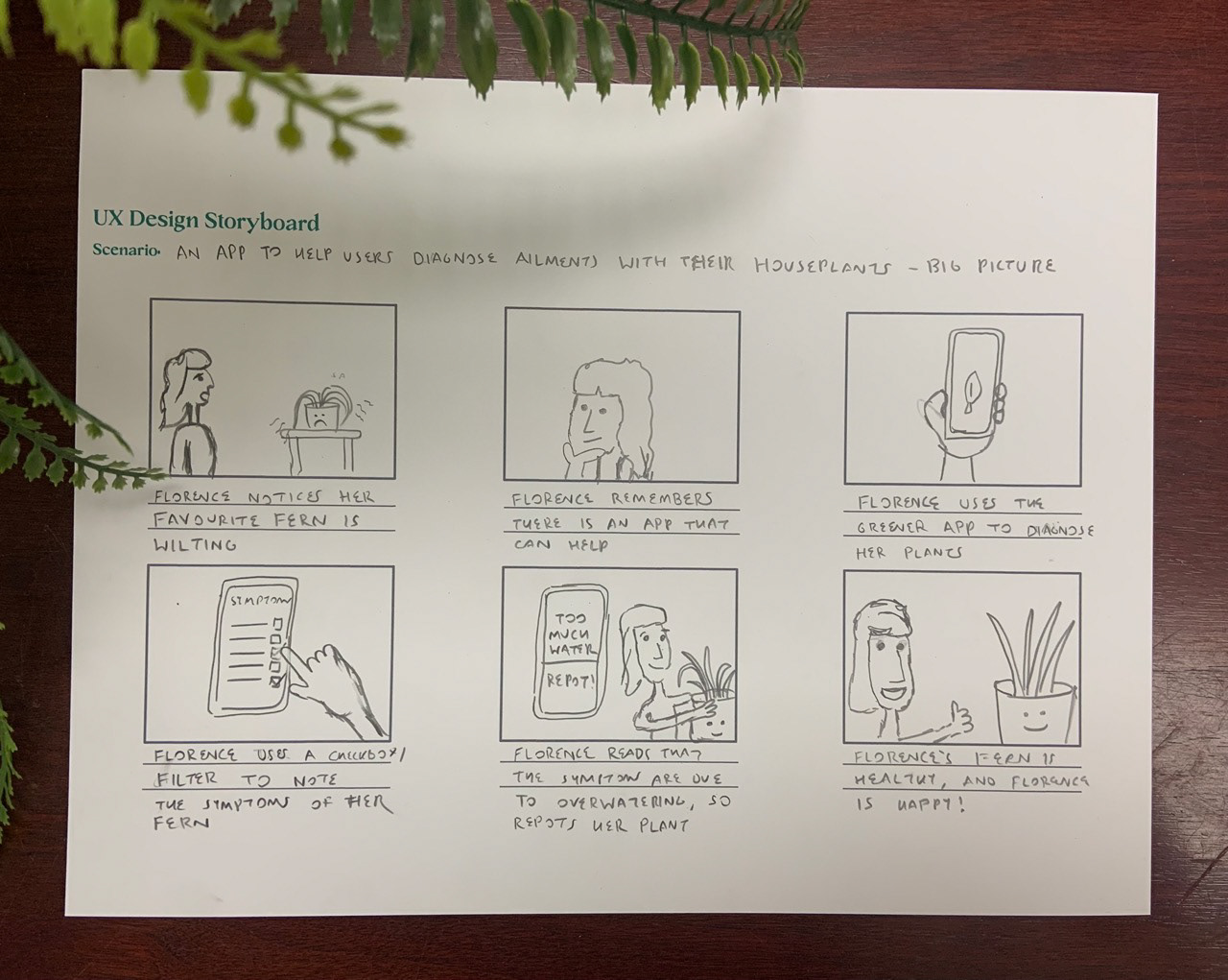
Storyboarding:
I made the decision to employ both big-picture and close-up storyboarding techniques for this project, to visualize how the how and why of the way the app will be used.
I used the stories of the personas I developed to imagine how these people would potentially interact with the app, allowing me to visualize what their needs would be on a user-by-user basis.
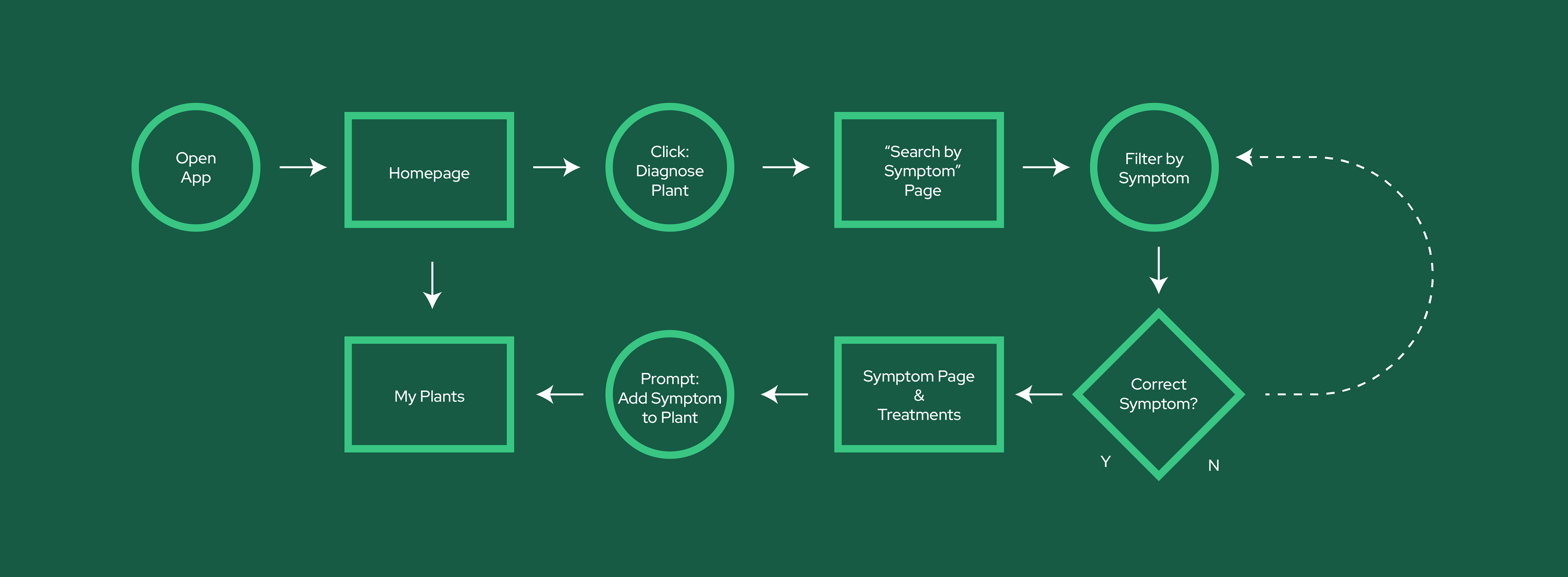
User Flow:
I created a user flow flow based on the needs of the company combined with the needs of the user. After delving into my personas, I realized that the flow would be best suited to a 3-pronged approach- a diagnostics tab, a plant management tab, and a store. This user-centric approach was achieved by identifying the user journey of both Florence and Oliver.
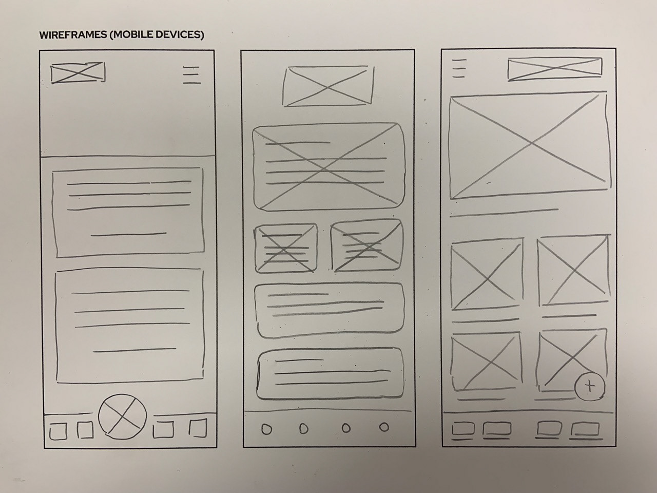
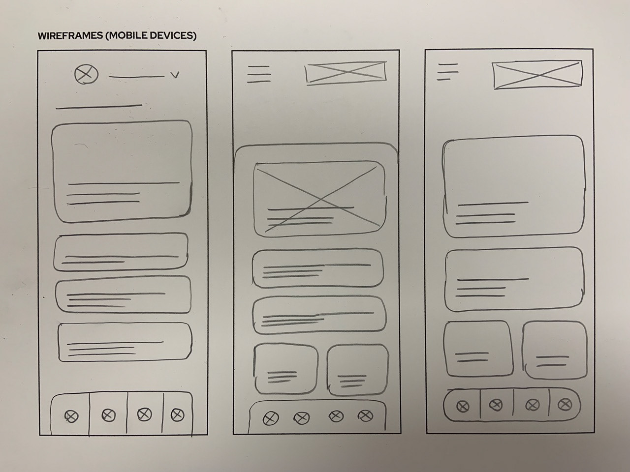
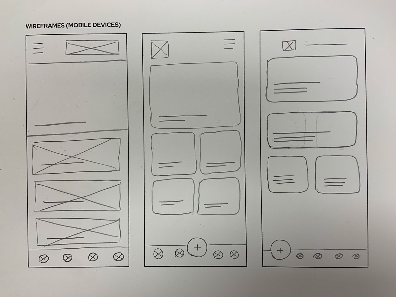
Rapid Sketching:
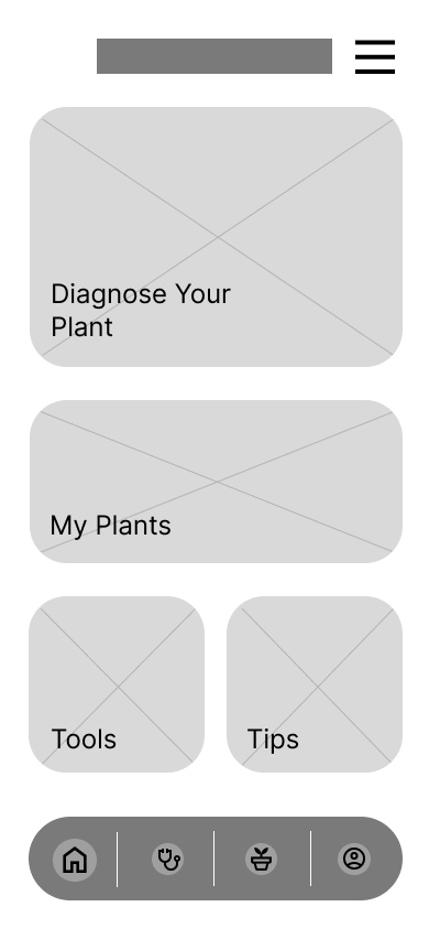
To address the needs of Florence and Oliver, I created wireframes to effectively find the design that would be most adaptable to the needs of the user. This rapid sketching wireframe approach allowed me to create a clear hierarchy and organization on the homepage, something I was then able to adapt further to each page in my low-fidelity mockup in Figma. This iterative process helped identify the most suitable design solutions for Greener to all user needs, as well as find the most suitable layout to adapt to the information architecture itself.
5. LO-FIDELITY PROTOTYPE USABILITY STUDY
Parameters:
Moderated Usability Study
5 Participants, Remote, Canada
15-20 minutes
5 Participants, Remote, Canada
15-20 minutes
Research Tasks & Questions:
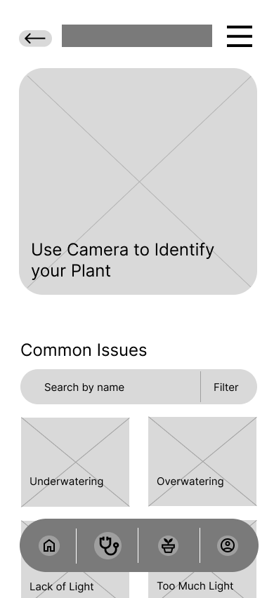
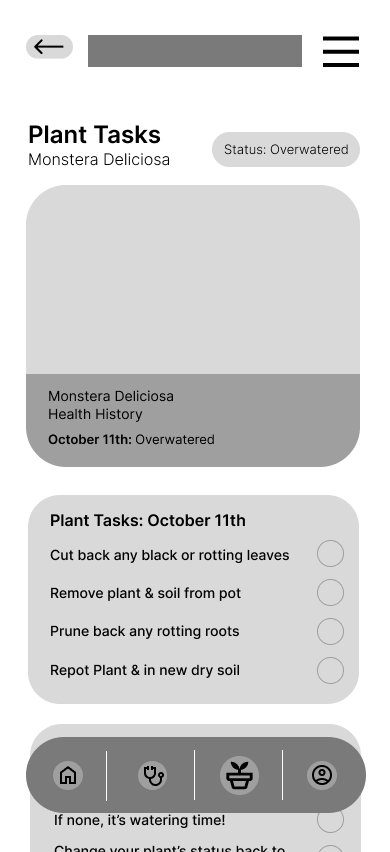
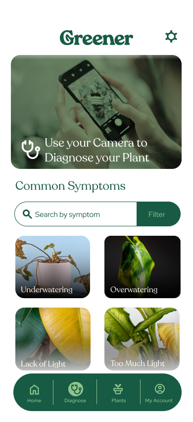
Diagnose your Monstera Deliciosa. It looks like this (image attached) Were you able to complete the task? What would you change about it?
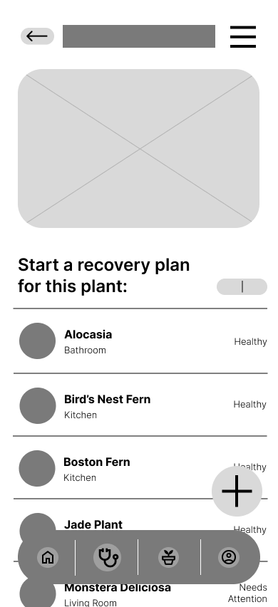
Now that you’ve diagnosed the plant, start a recovery plan for the Monstera, navigate to the Plant Tasks screen. Were you able to find your way to the plant tasks screen? Was it simple?
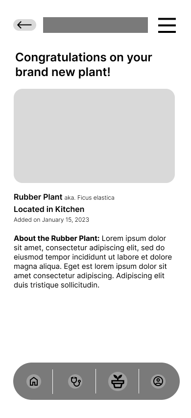
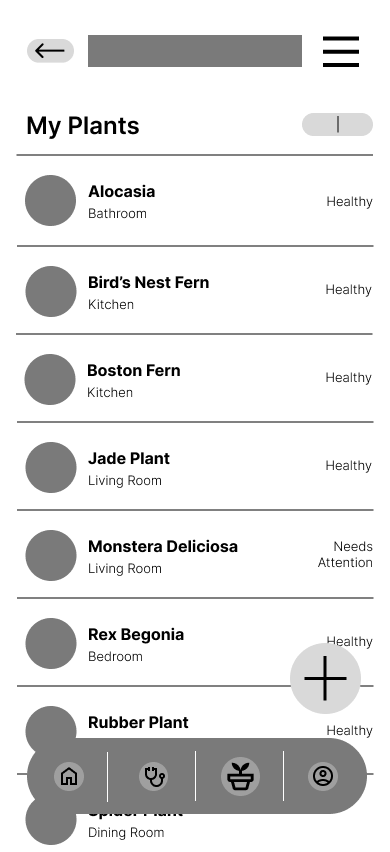
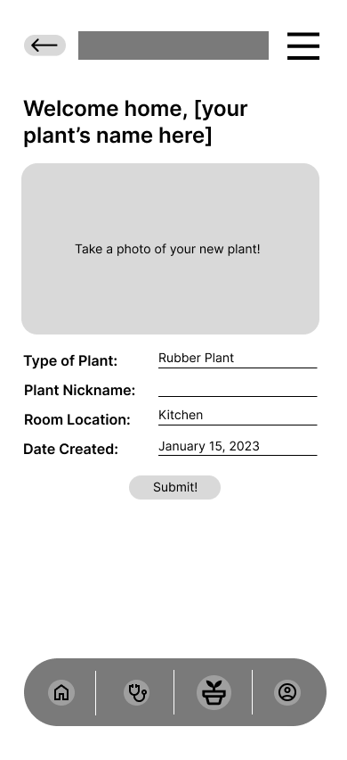
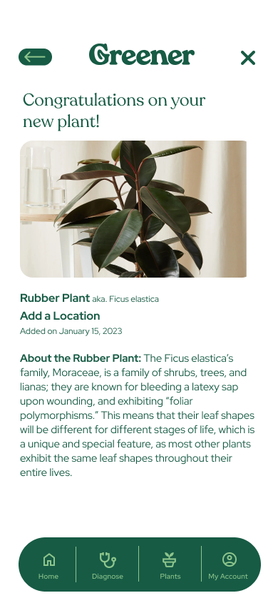
Return to the Home Screen. You’ve just purchased a brand new addition to your plant family- a Rubber Plant. Add it to your list of plants. Were you able to add it successfully?
What difficulties did you face throughout the last 3 tasks? How would you fix them?
Summary:
The low-fidelity prototype usability study was aimed at identifying and addressing issues regarding identifying plant symptoms, and adding a plant to your list of plants. My goal was to gain knowledge and insight into the speed bumps users hit when confronted with specific tasks.
My roles during this specific usability study included participant recruitment, development of user tasks, capturing data, and analyzing and synthesizing said data to determine pain points, accessibility issues, and any other patterns along the way.
In total, a number of changes were made to the app after the initial usability study, including but not limited to the hierarchy of the homepage, the sizing of buttons, menu placement changes, and changing of points in the user flow to make it more seamless.
In total, a number of changes were made to the app after the initial usability study, including but not limited to the hierarchy of the homepage, the sizing of buttons, menu placement changes, and changing of points in the user flow to make it more seamless.
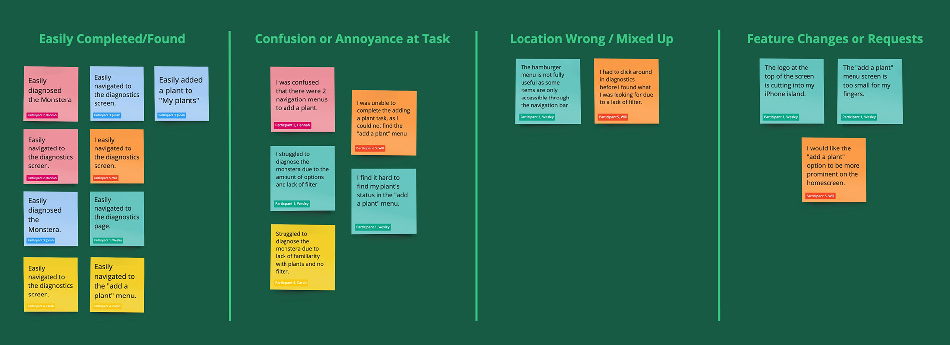
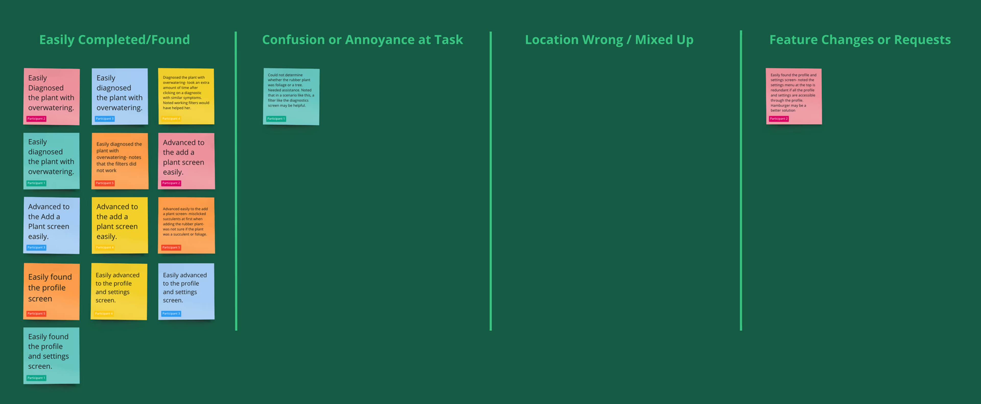
Affinity Map & Insights:
Upon finishing my low-fidelity usability study, I gathered all of my accumulated feedback and categorized my notes into an affinity map. These findings helped me diagnose the following issues:
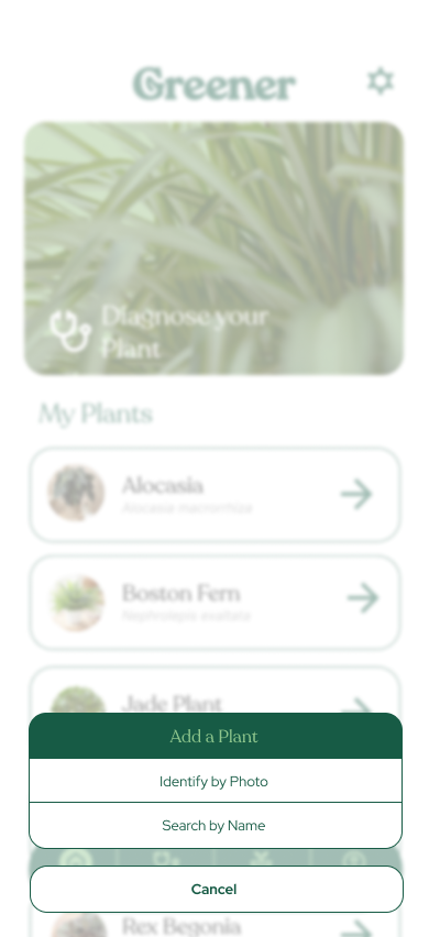
Based on the theme that a majority of users were confused at the location of the "Add a Plant" screen, an insight is that users should be able to find the "Add a Plant" screen more easily.
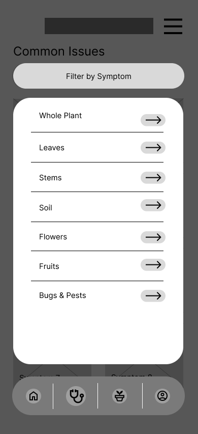
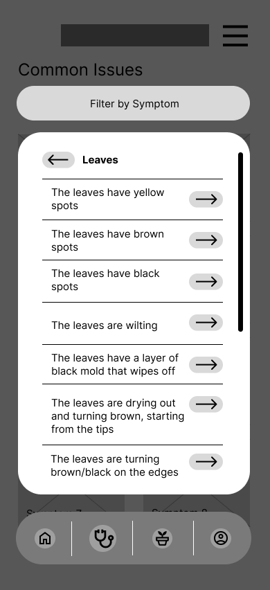
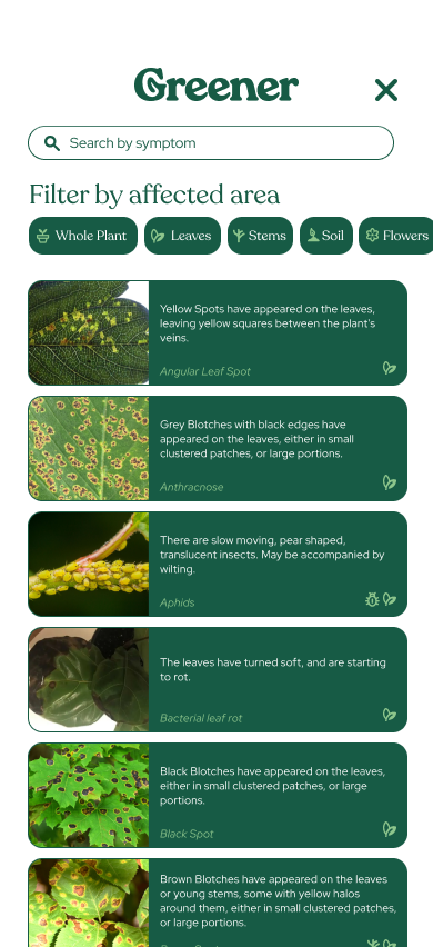
Based on the theme that a few users struggled to diagnose their plant correctly due to how many ailments can affect plants, an insight is that users should be able to filter their plant ailment by affected area of plant and type of ailment.
Based on the theme that a few users attempted to find the "Add a Plant" screen in the hamburger menu, an insight is that the "Add a Plant" screen should be in a more obvious and accessible location.
Based on the theme that a few users struggled to press the "Add a Plant" button, an insight is that for accessibility reasons, the "Add a Plant" button must be made larger.
6. DESIGN SYSTEM
Type Styles:
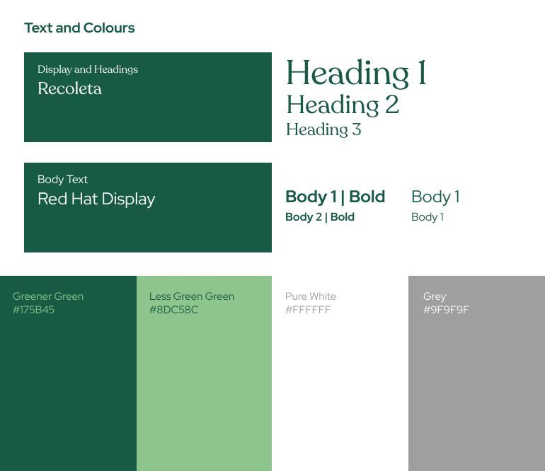
The app utilizes Recoleta as the primary font, its friendly and characteristic serifs lending well to an app meant to be a helper. Semi-bold font weights are used for Headings and Subheadings, often set in green.
Recoleta is accompanied by a clean and legible partner in Red Hat display, taking up the role of pinning the, body text, and UI elements.
These fonts were carefully chosen to ensure a legible and consistent design across the entire brand.
Style Guide:
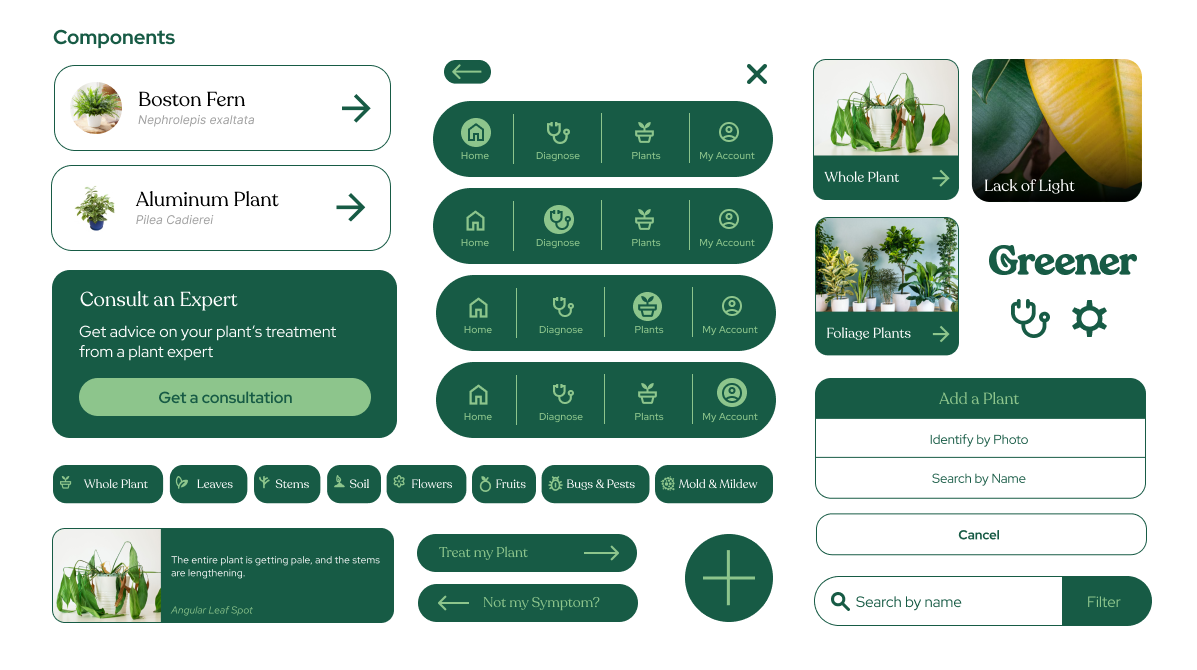
For this style guide, I incorporated Gestalt principles to create a streamlined and user-centric design. This style guide does not adhere to a particular existing design system, such as Google Material Design, but does utilize existing conventions to create a seamless and familiar design language.
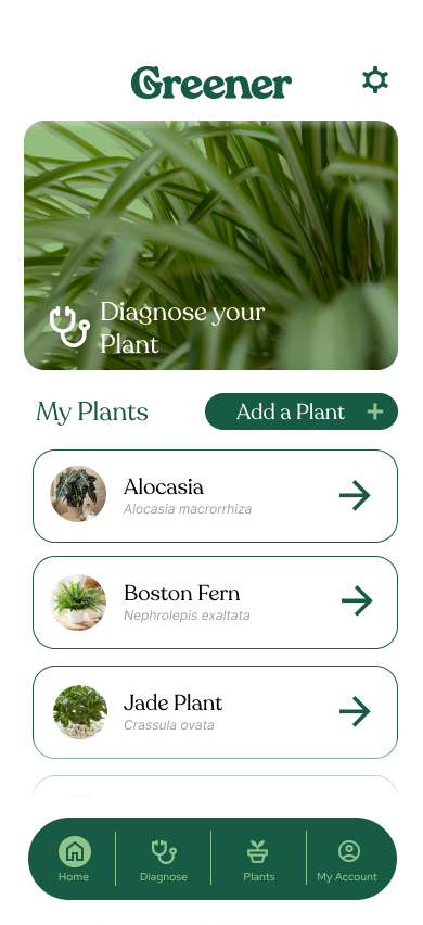
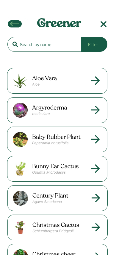
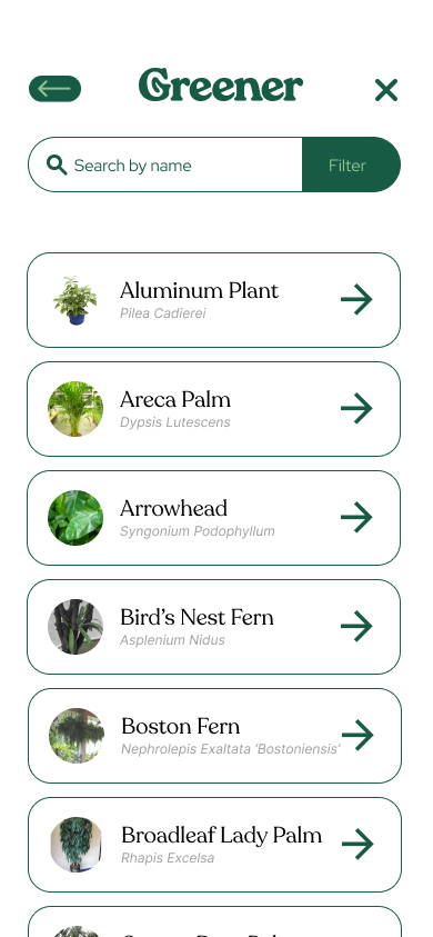
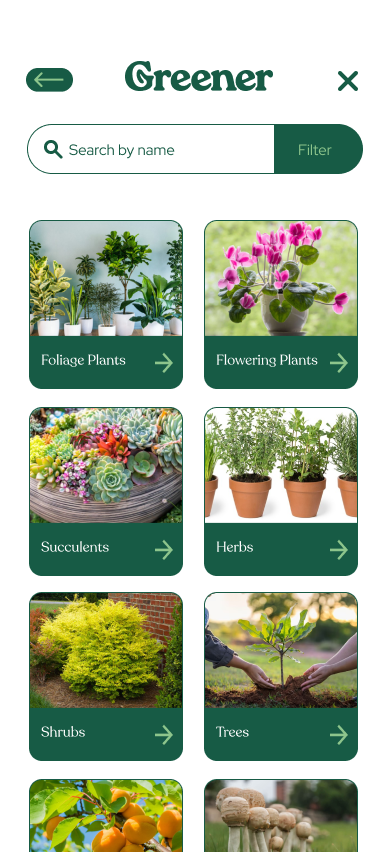
I incorporated a minimalist card-based design for the menu screens, focusing on key information through building hierarchy in the design. The design includes a 3-colour scheme, with rich lush greens accompanied by a lighter highlight shade, all on a minimalist white background. The design itself includes modified iconography from the Google Material Design library, ensuring a familiar user experience.
7. HI-FIDELITY PROTOTYPE USABILITY STUDY
Parameters:
Moderated Usability Study
5 Participants, Remote, Canada
15-20 minutes
5 Participants, Remote, Canada
15-20 minutes
Research Tasks & Questions:
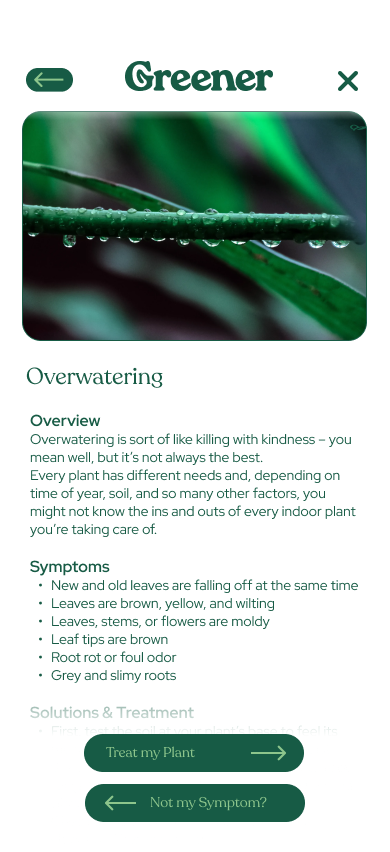
Diagnose your Monstera Deliciosa. It looks like this (image attached, plant with brown sagging leaf tips, yellowing, and wilting) Were you able to complete the task? What would you change about it?
Return to the Home Screen. You’ve just purchased a brand new addition to your plant family- a Rubber Plant. Add it to your list of plants. Were you able to add it successfully?
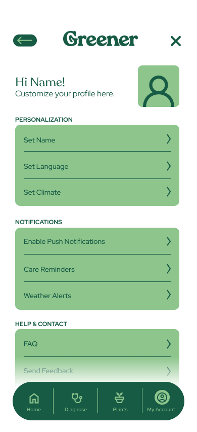
Navigate to the brand new profile and settings screen, and change your display name and language. Were you able to easily find it and complete the tasks?
What difficulties did you face throughout the last 3 tasks? How would you fix them?
Summary:
The second usability study, the high-fidelity prototype, was aimed at verifying if the updated UI improved user's ability to navigate the flow more efficiently, and whether the problems identified in the first usability study were adequately addressed.
My roles during this specific usability study once again included participant recruitment, development of user tasks, capturing data, and analyzing and synthesizing said data to determine pain points, accessibility issues, and any other patterns along the way.
After the second usability study, I felt as if the app is in a very good place with only minor changes and additions to be iterated on. These included making sure the symptoms filter is functional for the final prototype, and making it easier for users who may have purchased a plant without knowing the name or type of the plant to accurately identify it.
After the second usability study, I felt as if the app is in a very good place with only minor changes and additions to be iterated on. These included making sure the symptoms filter is functional for the final prototype, and making it easier for users who may have purchased a plant without knowing the name or type of the plant to accurately identify it.
Affinity Map & Insights:
Upon finishing my high-fidelity usability study, I gathered all of my accumulated feedback and categorized my notes into an affinity map. These findings helped me diagnose the following issues:
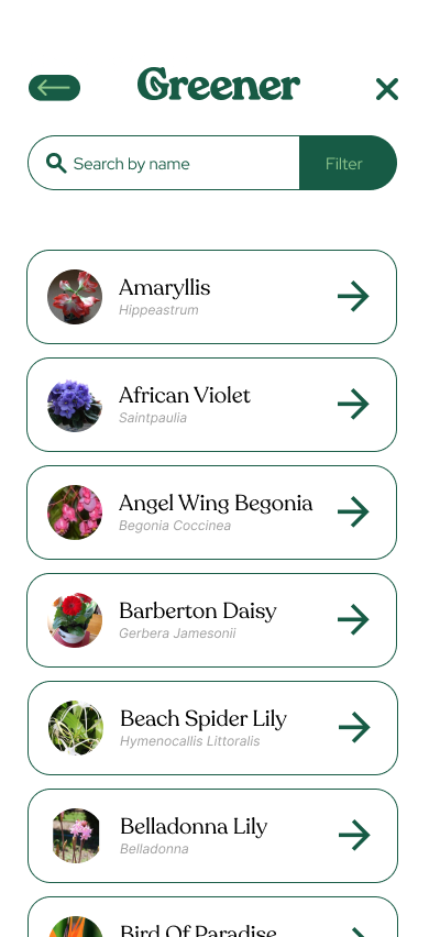
A few users were confused at the type of the plant they were asked to identify. A possible solution to this is to add an indicator as to the plant type for the various plants, as well as a search field.
A number of users mentioned the filters on the prototype did not work, and that it would have helped to narrow down the plant symptoms. Obviously the insight for this is that the final version of the app needs to have a fully functional filter.
A user mentioned redundancy on the profile and settings page having two entry points to get to the same location. This could be remedied by either splitting into two pages or simply getting rid of the gear icon.
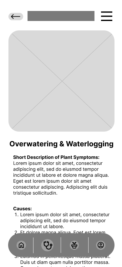
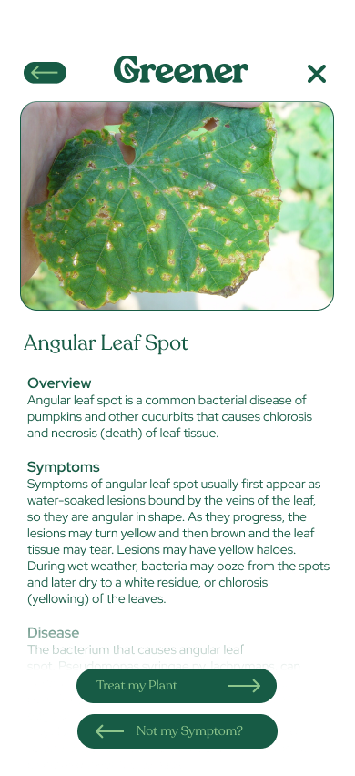
Mentioned post-interview by a user was the symptoms screens for angular leaf spot and overwatering have different layouts, in the sense that symptoms are bound by bullet points in the latter, while the former is a wall of text. This could be sorted and made much more digestible for users who may have learning disabilities by making sure all are sorted by bullets.
8. TAKEAWAYS
Lessons Learned:
Designing a dedicated page for each individual symptom would be a crucial step to evaluate and address any potential additional requirements or considerations.
Establishing a responsive website version of the project would provide additional insights and challenges that could be applied to future projects.
Next Steps:
HIGH-FIDELITY PROTOTYPE:
After the conclusive user study, final adjustments were made to the high-fidelity prototype, of which were informed by the insights gained. The goal of creating a clear hierarchy and visual cues was met to allow users to quickly understand the process of both identifying new houseplant, & identifying ailments on their houseplant. This enabled them to stay focused on the primary user flow.
After the conclusive user study, final adjustments were made to the high-fidelity prototype, of which were informed by the insights gained. The goal of creating a clear hierarchy and visual cues was met to allow users to quickly understand the process of both identifying new houseplant, & identifying ailments on their houseplant. This enabled them to stay focused on the primary user flow.
NEXT STEPS:
Profile Page: An updated profile page with a competed prototype would be a good next step to understand the plan for converting houseplant owners to customers.
Profile Page: An updated profile page with a competed prototype would be a good next step to understand the plan for converting houseplant owners to customers.
Animations: Animations that guide the user through the flow being added to the prototype would be an important next step to gain understanding of how the user would track their progress throughout the experience.
TAKEAWAYS:
Throughout the design process, I realized the importance of considering accessibility and how incorporating diverse perspectives can lead to unique user flows that ultimately benefit all users. By embracing inclusivity and accommodating various user needs, I learned how to enhance the user experience and ensure that my design is accessible to all.
Throughout the design process, I realized the importance of considering accessibility and how incorporating diverse perspectives can lead to unique user flows that ultimately benefit all users. By embracing inclusivity and accommodating various user needs, I learned how to enhance the user experience and ensure that my design is accessible to all.