Project Overview:
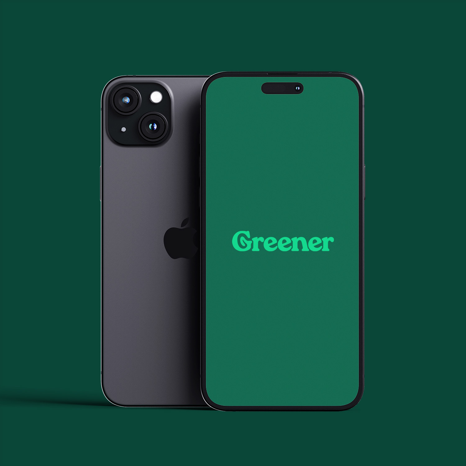
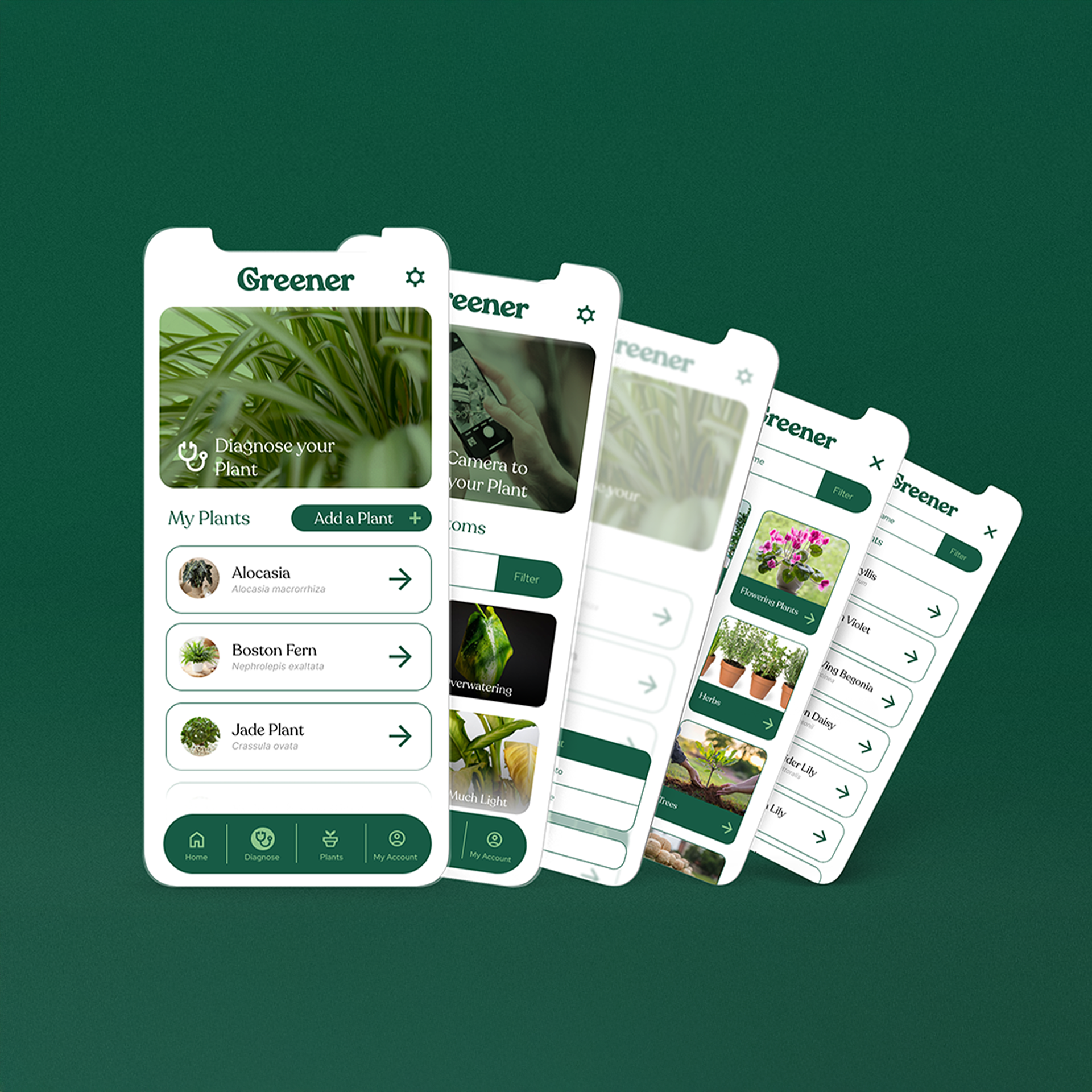
Introducing Greener, a plant management & identification app— the app meant for plant parents! Creating a brand identity that embodies both friendliness and knowledgeability was the primary challenge for this project, with the Greener app providing a helping hand in caring for your houseplants, all from your pocket.
The outcome is a clean, bold, and smart aesthetic rooted in stylized minimalism, accentuated by the inclusion of swooping serif fonts like Recoleta, and a family of illustrations and icons meant to work in tandem, all within the app!
Project Scope:
Full Brand Identity
Services Rendered:
Art Direction | Style Guides | Graphic Design | Brand Identity | UX Design
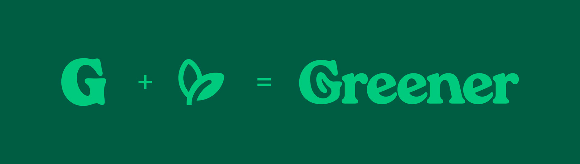
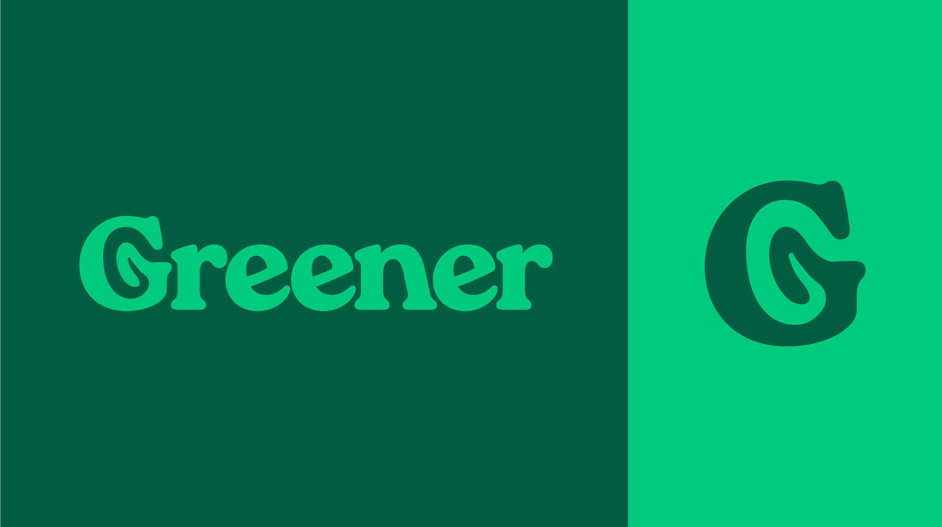
Logo Anatomy & Brand Design
The logo takes the capital G form and combines it with the shape of a leaf, creating a legible and memorable G shape.
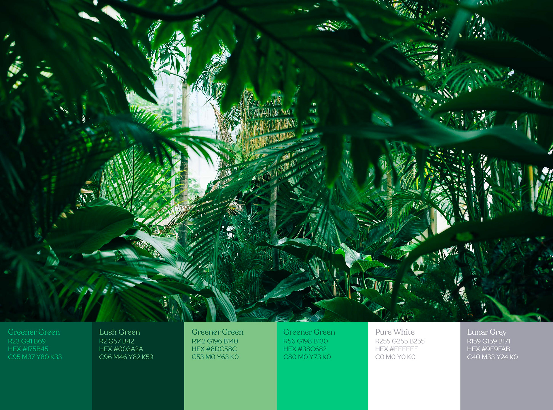
The brand identity is made up of various greens, working in tandem on whites in-app to create a seamless user experience.
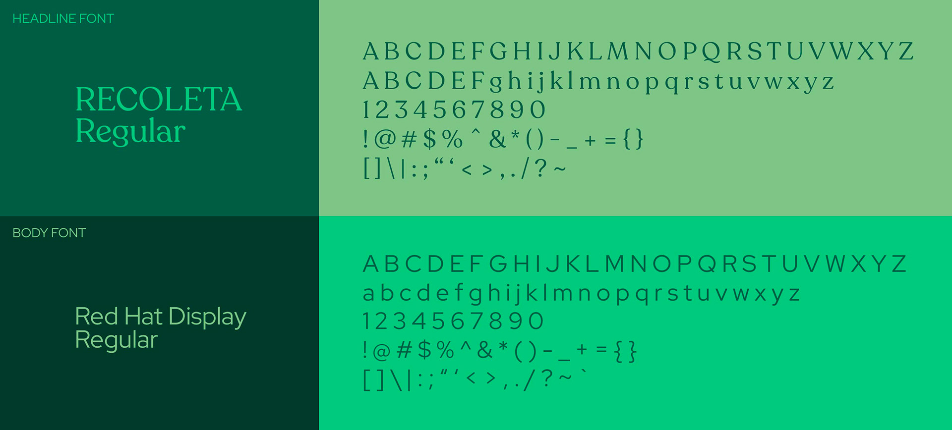
Fonts include Recoleta for Headlines and Subtitles, and Red Hat Display for body text.
The Brand in Action
The Greener App can be found in action in these mockups, which include splash screens, app screens, and more.