Project Overview:
After a 2022 merger with Divebomb media, AutoRacingConnected needed a brand new logo & personality for their esports league, including social media templates, a website, individual logos for each series, merchandise and more.
We worked to create a brand that was adaptable and cohesive for all situations as ARC has big ambitions for expansion within the esports realm.
Picking typefaces that worked across all systems was important as well, as AutoRacingConnected is run by committee, each person taking a different role. So maintaining the brand across multiple people using the template was a very important part.
Project Scope:
Full Brand Identity
Services Rendered:
Art Direction | Style Guides | UX Design | Social Media Design | Graphic Design | Brand Identity
Keeping the ARC Ethos
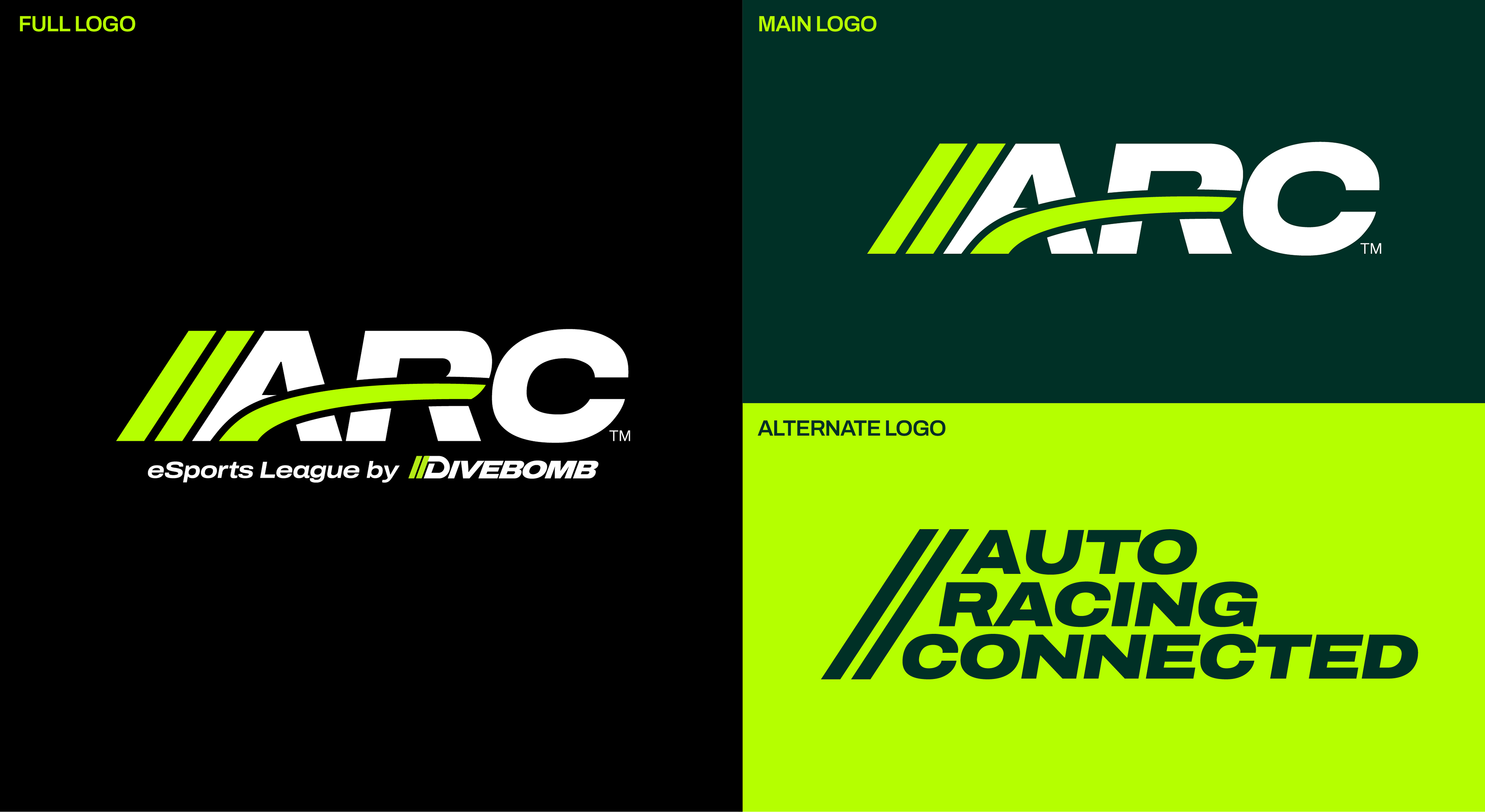
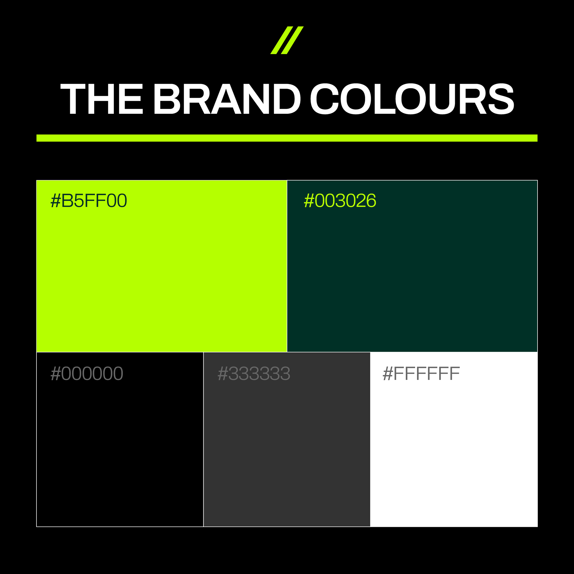
ARC as a brand has existed in form since 2016, existing mostly in a digital realm as opposed to on physical media. It had an existing logo, used in colours Torch Red (#ff0041) and Pure White.
These considerations were all very important heading into the logo redesign, as the brand transitioned into a new age after being merged into Divebomb Media.
This meant new colours, new usage cases, and all new social media templates.
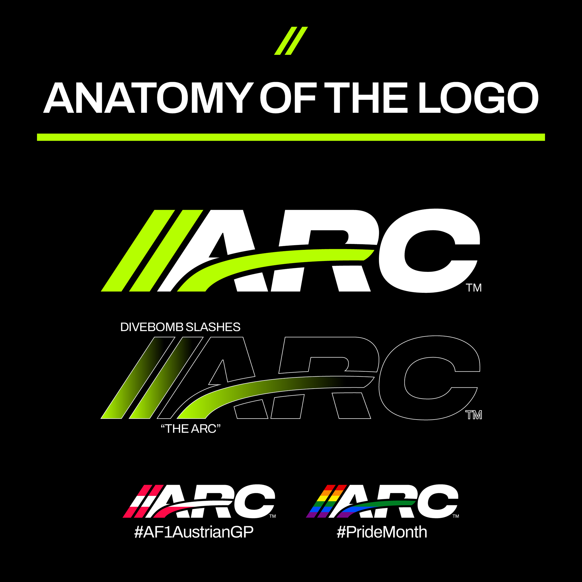
The redesigned ARC logo consists of multiple intentional components, the "Divebomb Slash" featured prominently on the left, indicating it is a part of Divebomb, while the ARC brand swoosh, also known as the "arc", connects the rest of the logo, building the crossbar on the A & R. It also is meant to show movement, being a motorsports league.
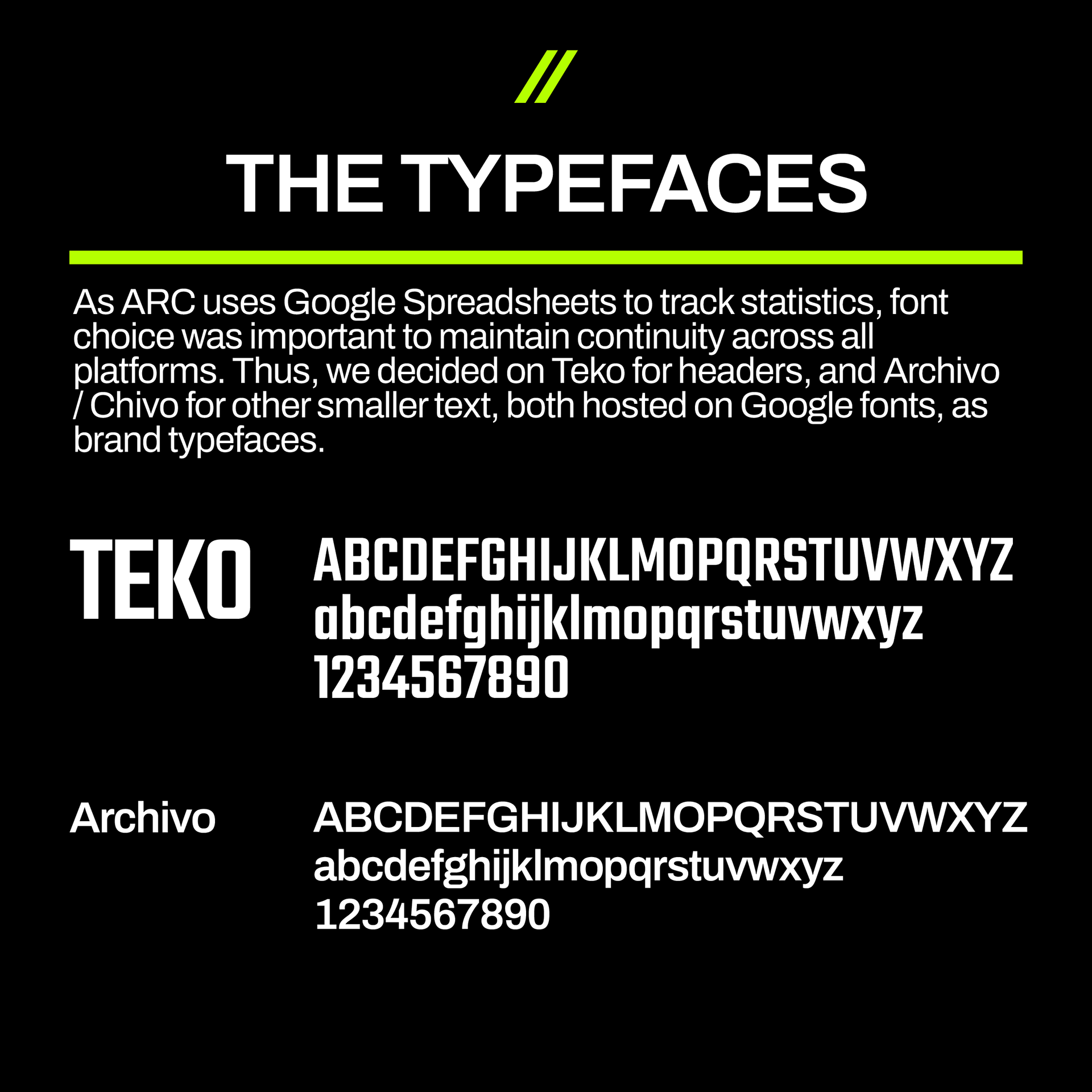
Font choice was paramount for the brand as the management of ARC is run by multiple committees, each responsible for different roles managed through an array of spreadsheets. Due to this, a limitation in font choice was found, in that the font had to be featured on Google Fonts.
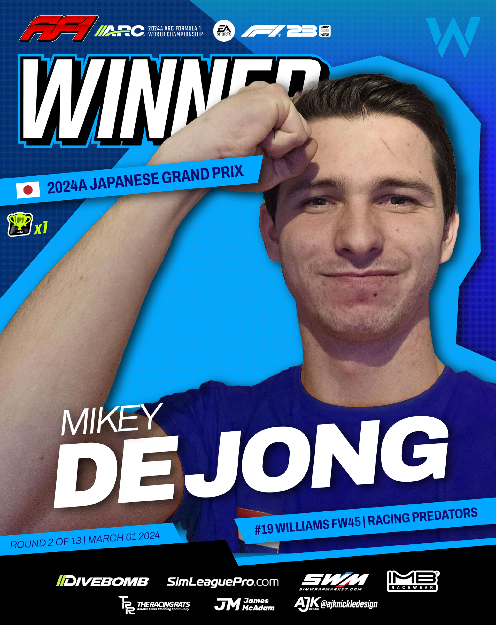
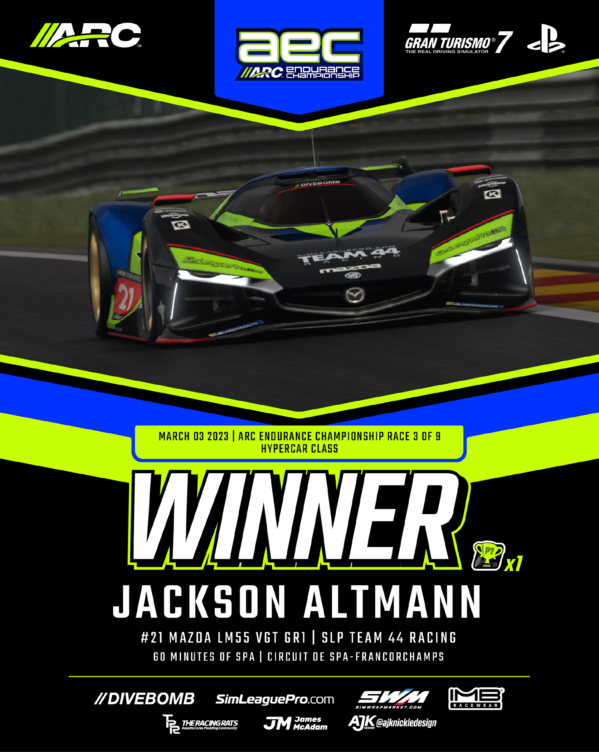
This led us to choose Teko as the main headline & titling font, while Archivo is used for everything else, having many different typeface variants ranging from Extended to Super Condensed. When Teko is used for iconography, such as the "WINNER" icon, it is often skewed at a 15 degree angle to the right, stroked, shadowed, and outlined.
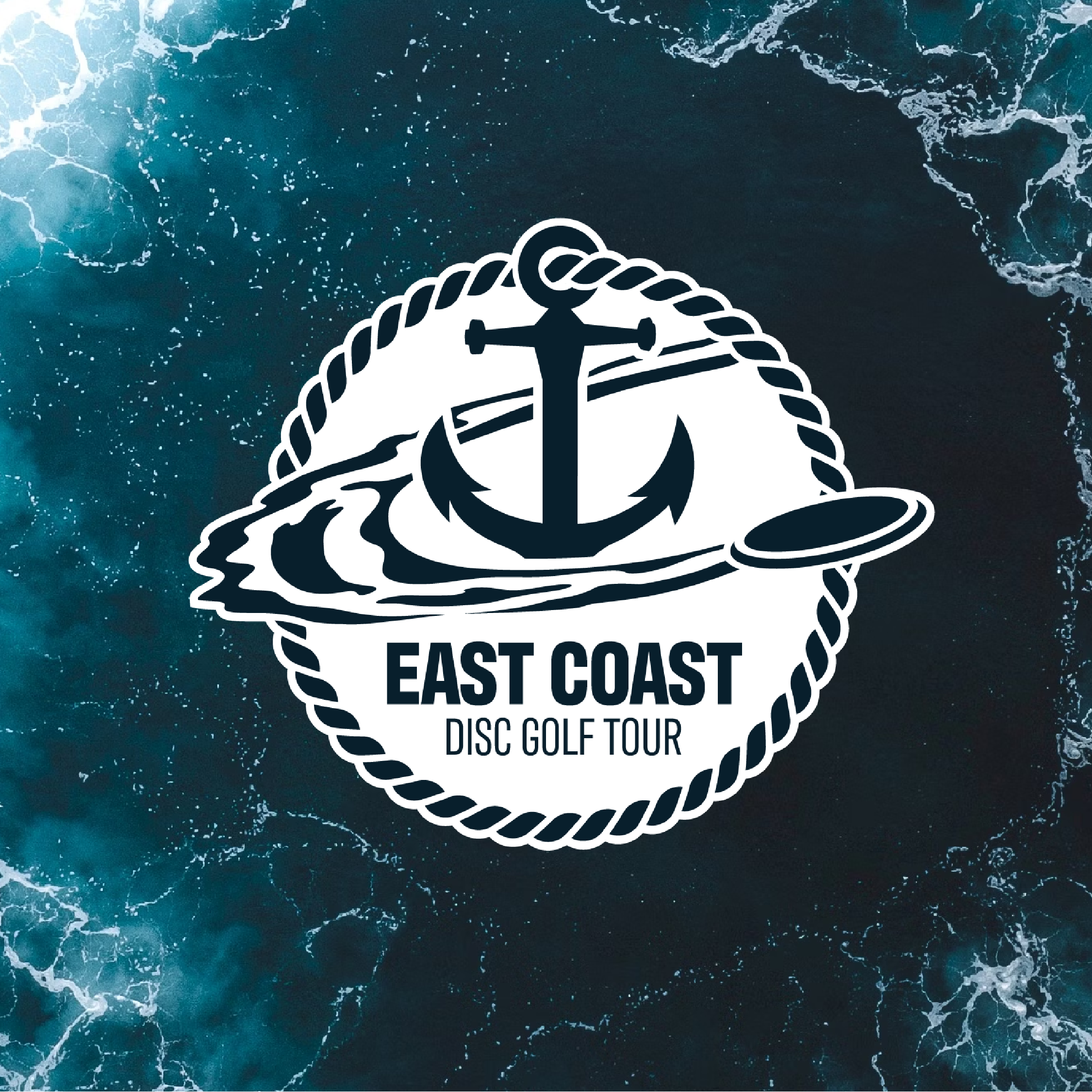
ARC is the main sanctioning body of the racing, much like the FIA to F1, so beyond the main logo, each series needed its own identity, referencing the real life counterpart, but existing within ARC's brand guidelines.
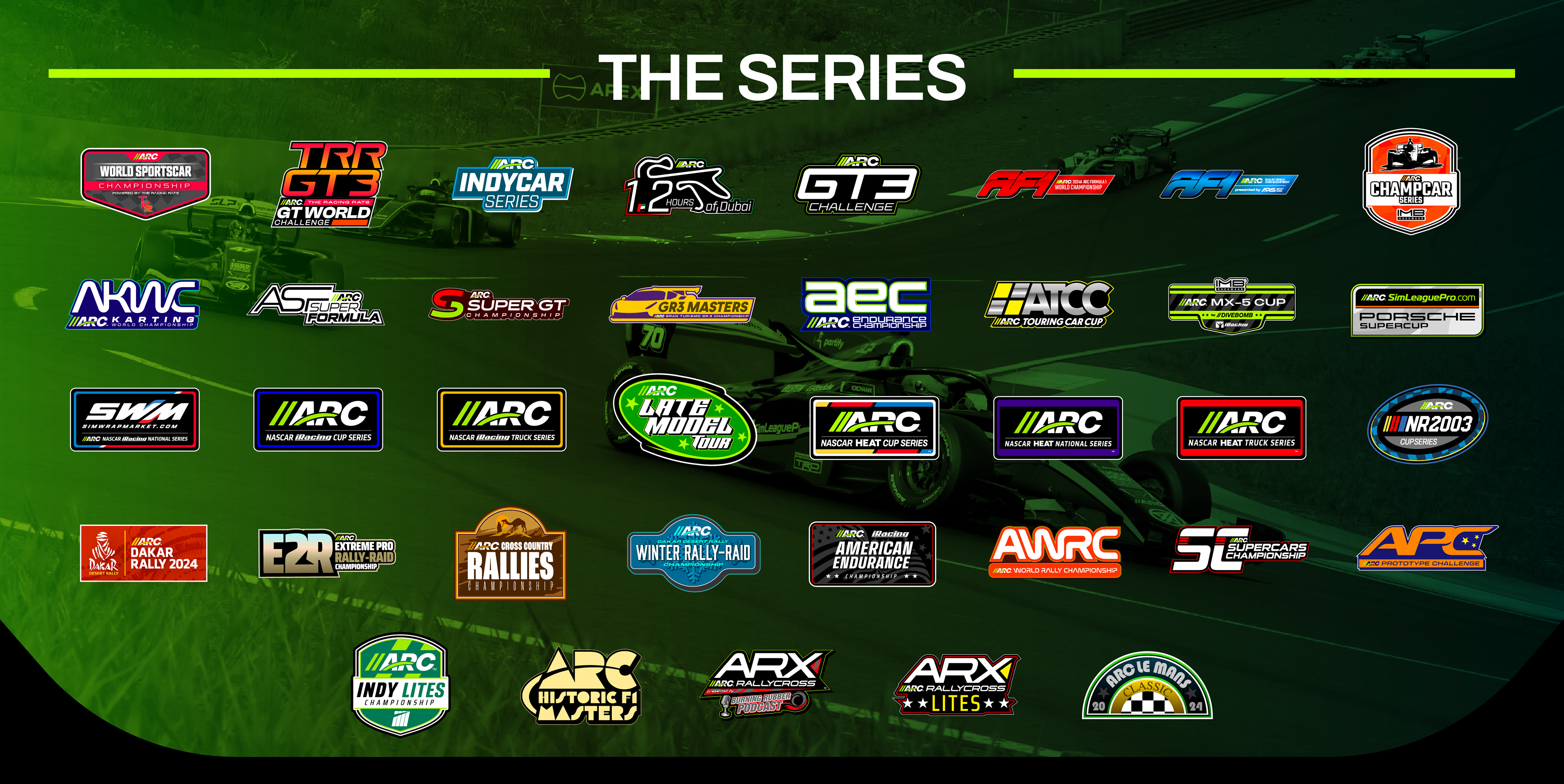
Designing for a Family of Logos
AutoRacingConnected in not just a single brand on its own, but a network of various series tackling multiple disciplines of motorsport.
In all of these series, ARC is the main sanctioning body of the racing, much like the FIA to F1, so beyond the main logo, each series needed its own identity, referencing the real life counterpart, but existing within ARC's brand guidelines.
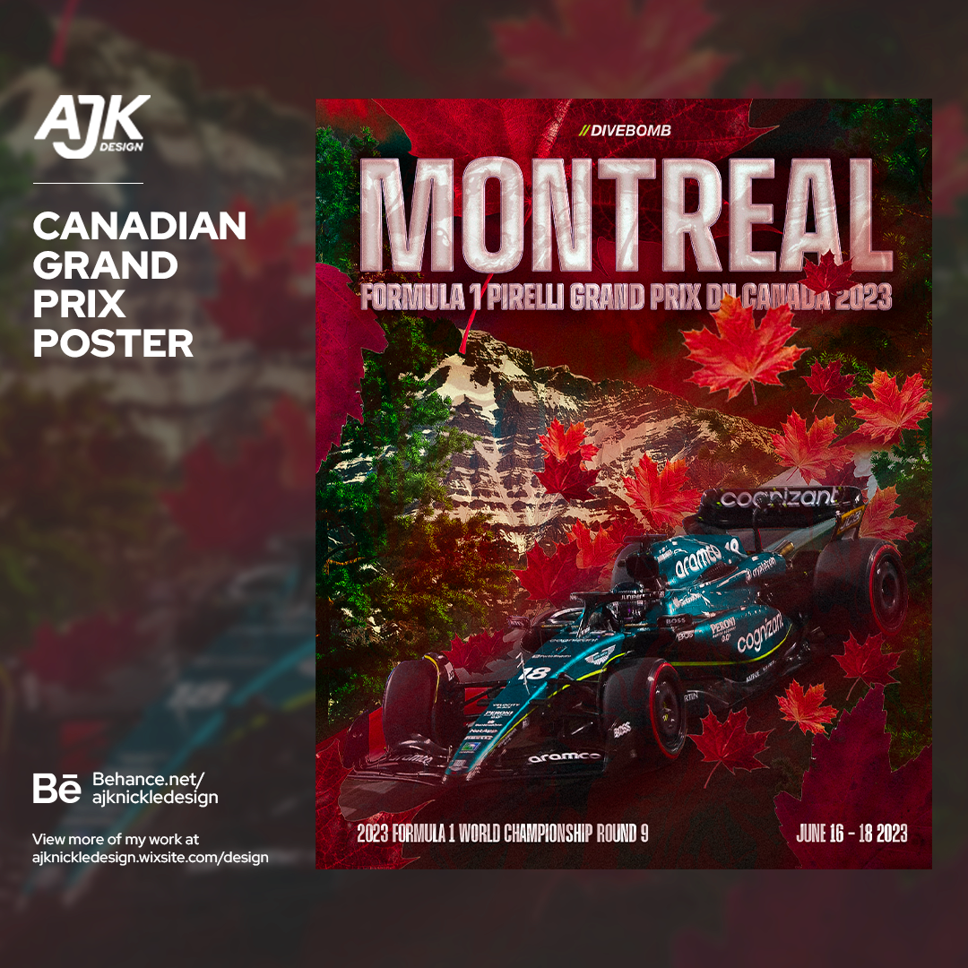
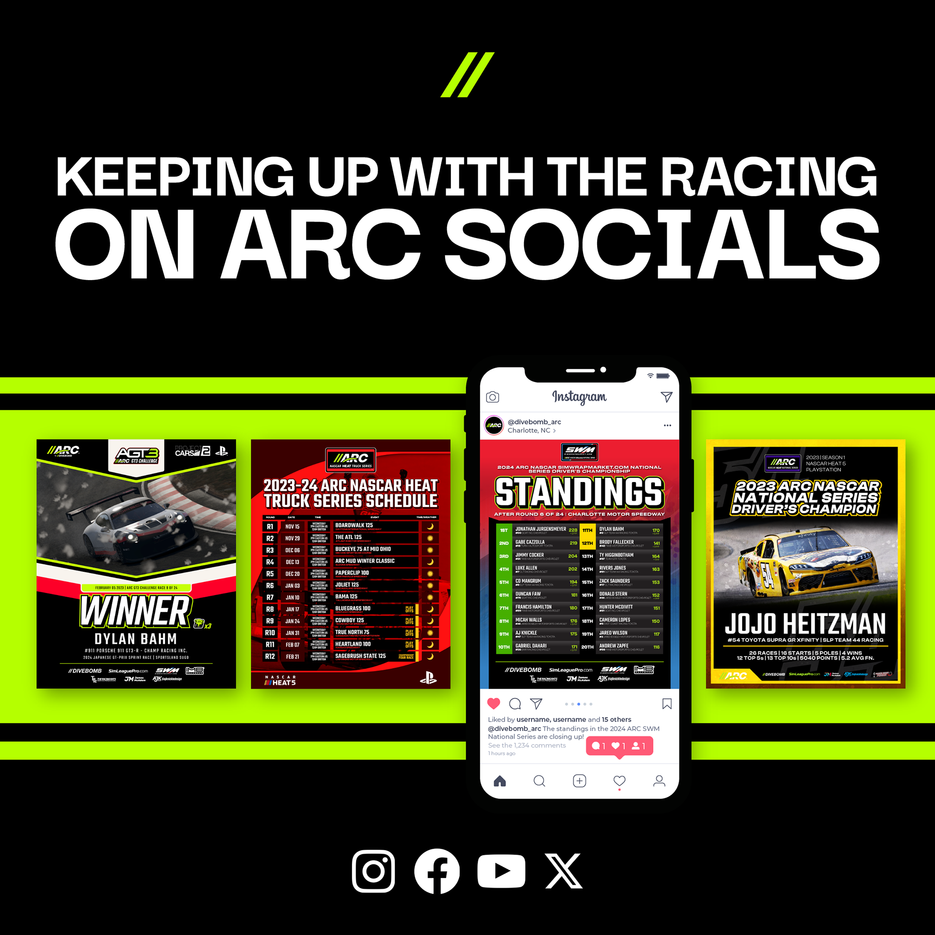
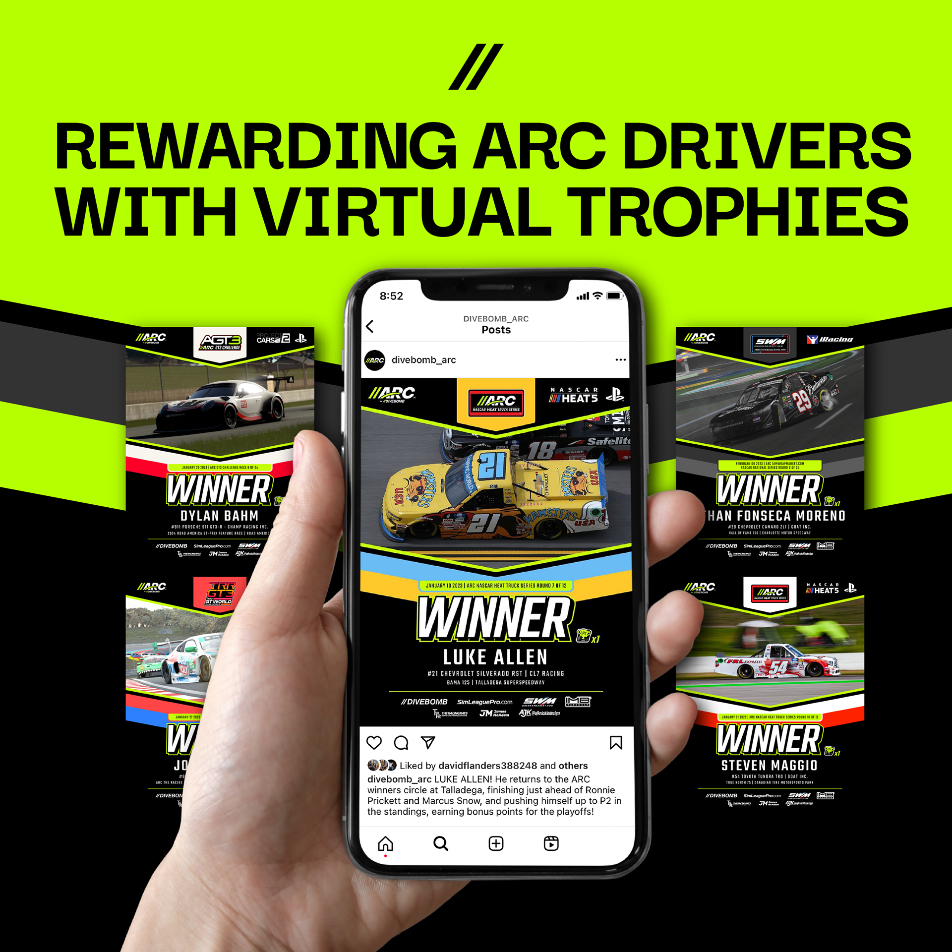
Social Media Design
As a brand that exists in the social media world, building a consistent brand identity was paramount. For each event, a "Win Post" is featured, where the driver who wins the event is featured prominently for their achievement.
Beyond that, posts had to be created for schedules, season standings, Breaking News and more.
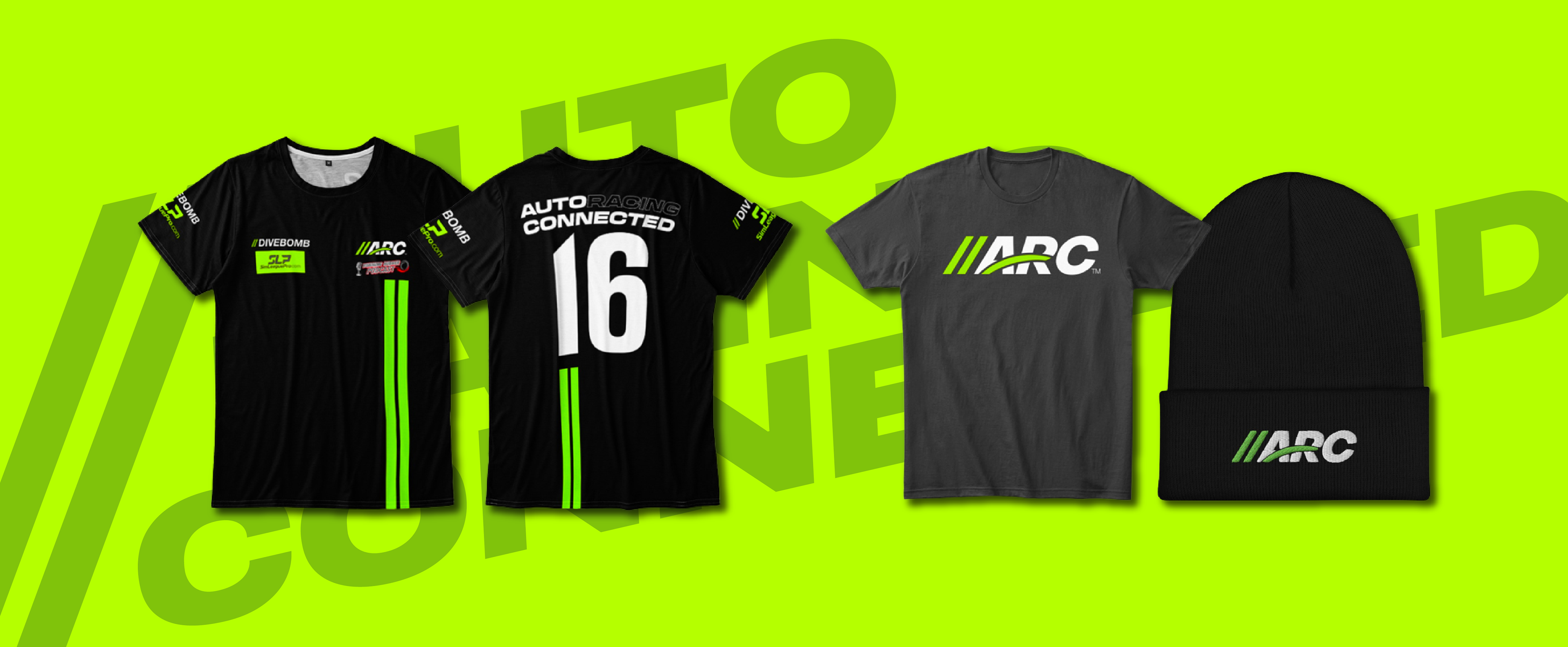
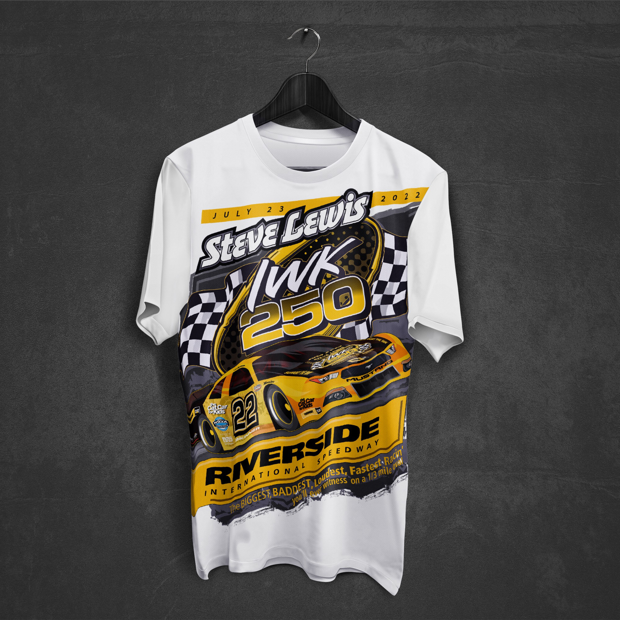
Merchandise Design
AutoRacingConnected is also launching a shop in 2024, with branded t-shirts, jerseys, hats, & stickers. As the merchandise is the main front-facing physical media in which the ARC logo is displayed, we took extra care on this task to assure the designs were in line with the ARC ethos.